In European royalty, getting dressed has never been just about clothes. In August 1954, Princess Alexandra of Kent, Queen Elizabeth II’s cousin, sent shockwaves through the British public when she showed up to play tennis in jeans.
It was a gesture that seemed trivial, but at the time, it was read as a challenge to protocol and Buckingham Palace's very own etiquette. Fashion in these aristocratic circles is a language, sometimes subtle, sometimes bold, where every garment and shade communicates an intention.
For decades, "diplomatic dressing" has relied on color as a silent but effective tool: red to command, blue to reassure, white for solemnity. However, one palette has gained ground in recent years due to its ability to soften an image without letting the wearer fade into the background: pastels.
 © GTRES
One only needs to recall Queen Letizia’s recent dusty pink dress at the Royal Palace or Princess Diana’s unforgettable lavender blue gown while asleep at an official event to understand that, in the monarchy, delicacy can also be deeply strategic.
Princess Diana: Softness with a Rebel Streak
Before becoming a global icon, Princess Diana was a teenager who learned to dress under public scrutiny. During that learning process, pastels played a fundamental role. The lemon yellow of her youthful overalls or that same-colored outfit she wore when meeting the Spanish royal family spoke of an almost calculated innocence.
 © Anwar Hussein
 © Princess Diana Archive
But if there is one image that encapsulates that era, it is the blue-violet dress by Bellville Sassoon in which she fell asleep in public. The photograph did not just irritate the then-Prince Charles; it also etched a vulnerable, human, almost ethereal Diana into the collective memory.
 © Tim Graham
Over the years, her wardrobe evolved toward sharper silhouettes and bolder tones, as seen in the famous "revenge dress," but she never entirely abandoned pastels. She incorporated them into menswear-inspired blazers and more structured outfits, creating a fascinating duality: strength and sweetness coexisting in the same image.
 © Princess Diana Archive
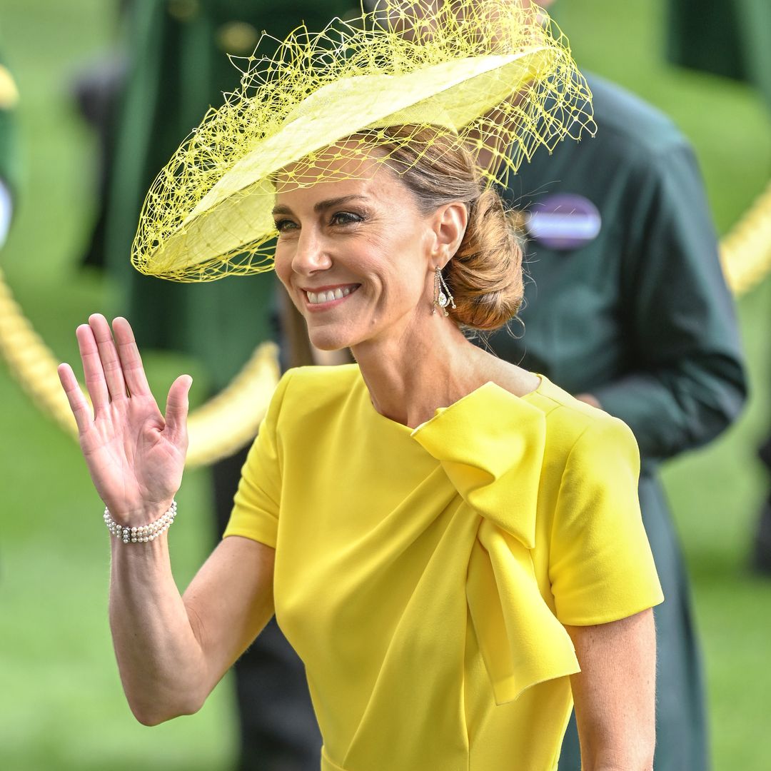
Kate Middleton: From Baby Blue to Power Tones
 © Brendon Thorne
When Kate Middleton joined the British royal family, her wardrobe seemed to be in direct conversation with Diana’s. During her first decade, pastels were almost uniform: baby-blue coats, soft-violet evening gowns, and even her first appearance after giving birth, styled in that same chromatic range.
 © Neil Mockford
Baby blue became her silent signature, a choice that was anything but accidental in an institution where color is carefully studied. That tone conveys calm, approachability, and stability, ideal qualities for a future queen in the making.
 © WPA Pool
However, as time has passed, her palette has darkened: burgundy, navy blue, chocolate brown. This isn’t a rejection, but an evolution. As happened with Diana, the chromatic shift accompanies a personal transformation: more authority, more presence, and more control over the visual narrative.
 © Clive Brunskill
Elizabeth II: The Queen of Color
 © Tim Graham
To talk about color in royalty is to talk about Queen Elizabeth II. Her preference for vibrant, almost fluorescent, tones followed a practical logic: to be seen. “I have to be seen to be believed,” she is famously quoted as saying.
 © Tim Graham
Yet, within that perfectly studied rainbow, pastels also had their place. Pale pinks, mint greens, or soft blues appeared in more relaxed contexts, where proximity to the public allowed for a lower intensity without losing presence.
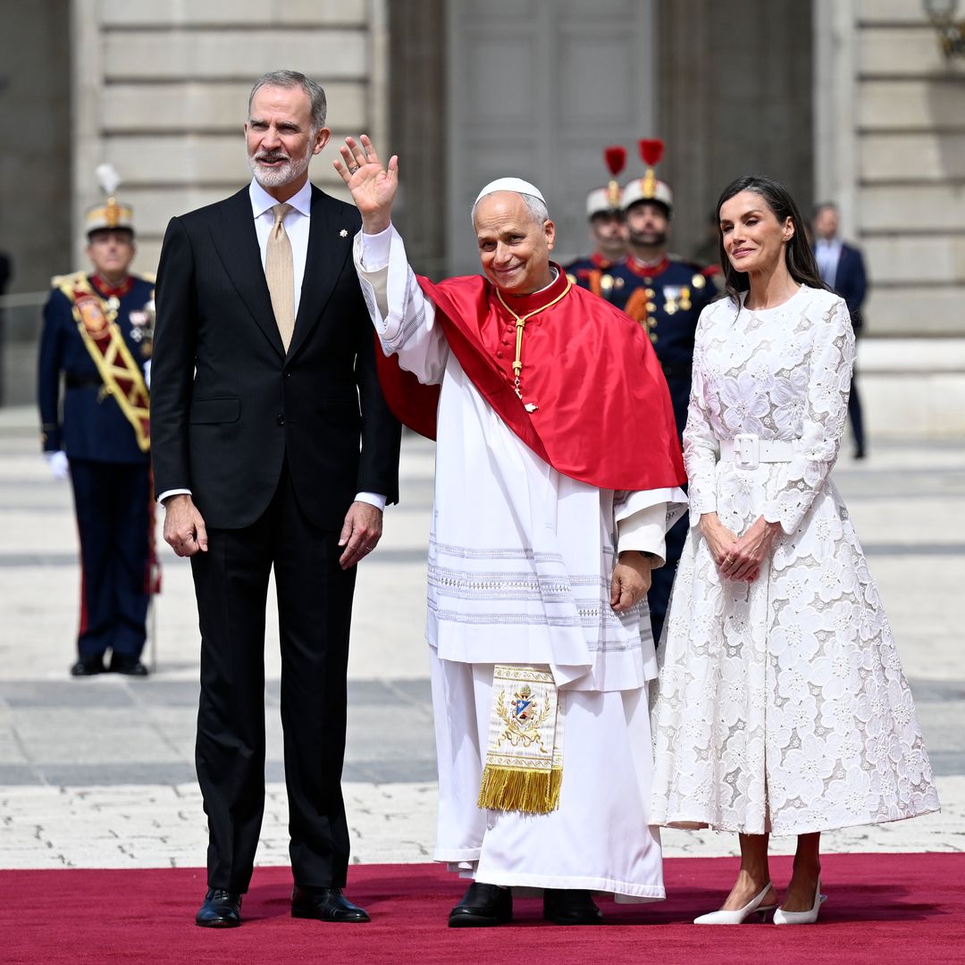
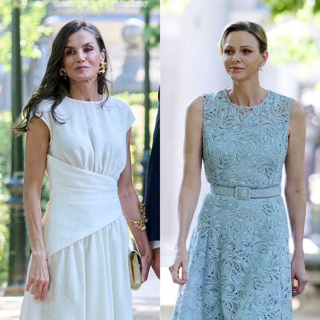
Queen Letizia: Balancing Authority and Softness
 © Lalo Yasky
In her early years as a royal, Letizia frequently opted for pastel pink, especially in skirt suits. It was a choice consistent with her position at the time: new, observed, measured.
 © Pablo Cuadra
Many looks defined that era as the Queen began to define her elegance and personality, setting herself apart from other royal women. Over time, that pink remained but evolved in form: dresses, jumpsuits, and flowing skirts. Baby blue also established itself as a wardrobe staple, particularly in shirts and clean-cut pieces.
 © Carlos Alvarez
Perhaps one of her most interesting moves has been her use of lilac in tailored suits: a combination that balances the masculine tailoring of the garment with the delicacy of the color.
 © Paolo Blocco
Princess Leonor: The Innocence of Beginnings
 © Carlos Alvarez
Blue seems to be one of the Princess’s favorite colors; she has worn it in its most pastel shade on several occasions, in both romantic dresses and suits that communicate power and authority.
 © Europa Press Entertainment
And she always hits the mark. Curiously, while she wears baby blue, she reserves pink for more vibrant, striking tones, perhaps to distance herself from the soft, "childish" connotations the shade can evoke.
From Monaco to Jordan: Pastels as a Global Language
 © WWD
© WWDThe taste for pastels is not exclusive to London or Madrid. Charlotte Casiraghi has made Chanel’s baby blue tweed almost an extension of her style, while her pink dresses at the Rose Ball confirm her affinity for this palette. An example of how pastels triumph in formal wear is seen at the 2013 Rose Ball. There, she made an impact with a mix of sweetness and cutting-edge modernity.
 © Pascal Le Segretain
Her mother, Caroline of Monaco, has demonstrated over the years that the same shade, light blue, can be reinterpreted without going out of style. And the next generation, represented by Alexandra of Hanover, continues that narrative with a contemporary twist.
 © SC Pool - Corbis
In Northern Europe, figures like Victoria of Sweden have turned to blue and pastel pink for official events. It is a color scheme that really works for her.
 © Andreas Rentz
For her part, Queen Máxima of the Netherlands elevates them with her usual color-blocking boldness.
 © Patrick van Katwijk
And if there is a queen who has made pastels a constant, it is Queen Rania of Jordan, who is capable of wearing these tones for everything from official portraits to state functions without losing an ounce of authority.
 © WPA Pool